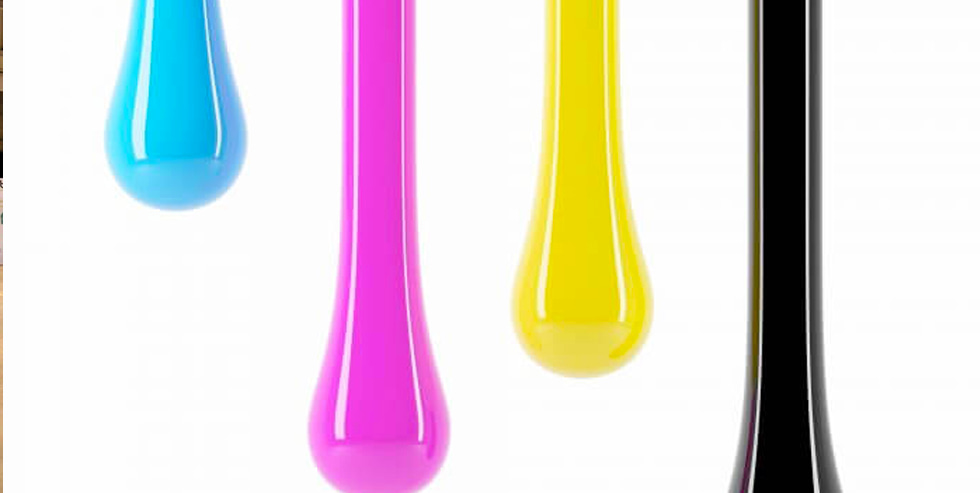
The psychological effects of colours have been studied by scientists for hundreds of years, but you only need to looks at the world around us to see and feel their impact. Every colour provokes a different and unique response from the viewer. Designers know the effects of different colours and when to use them.
, In addition, the vibrancy of the colour must always be considered, how light or dark it is. Brighter shades tend to be more energetic while darker shades are more relaxing. Choosing the right colour is not enough the hue must also be considered.
Here are 6 colours all which create their own effects…
Red
Passionate, Aggressive, Important
A dominating colour Red adds gravity and awareness. Red can be associated with both love and war but the overall meaning is a sense of importance. Red is best used cautiously. It has an ability to attract attention but used excessively it will create tension. Lighter shades emphasise energy and youthfulness darker shades emphasise power.
Orange
Playful, Energetic, Cheap
Orange can add excitement without being too severe. It is playful and plays on haste and impulse. It can suggest health vitality and fun. The lighter the shade, the more light-hearted the mood, often used by the cheaper brands.
Yellow
Happy, Friendly, Warming
Yellow is associated with happiness but also activates the anxiety centre of the brain. It is able to stimulate and vitalise. It is the colour of warning signs. It needs to be used sparingly because potentially it can have a negative effect. Lighter shades play on the happiness of summer sun.
Green
Natural, Stable, Prosperous
Green represents the outdoors and environment. It is the clear choice for anything suggesting the nature of having an organic quality. It is the most balanced of colours giving an air of stability. In western cultures, it represents money and financial security.
Blue
Serene, Trustworthy, Inviting
Blue is the colour of trust it inspires security and a feeling of safety. For this reason, it is often used by banks being friendly and inviting it is also the colour of Facebook and Twitter.
It is also incredibly versatile light blue is the colour of water and sky giving it a refreshing and free feeling, even energising while still being reliable and calm. However, it should not be used for food-related projects as blue foods are not common in the wild it acts as an appetite suppressant.
Dark blues are sombre increasing the feeling of security a great choice for professionalism.
Purple
Luxurious, Mysterious, Romantic
Having long been associated with loyalty purple creates an air of luxury and decadence. Using purple will immediately give a sense of elegance and a high-end appeal, quite the opposite of orange. Lighter shades bring a feeling of romance and spring. Darker shades create mystery and will turn the romance more sensual.
Colour theories have been researched and validated by studies and research over many years. We live in a very colourful world you only have to look around you to see how different companies use different colours for logos, adverts, promotional materials. All these colours have been selected as a deliberate choice to target their market and create a certain mood.
Tell us about your project
Designing marketing material
Written By Kim Burrage
Managing Director at Trident


How Can I Use Schema Markup To Improve My Website’s SEO Performance?
Schema Markup is an essential tool for improving the SEO performance of your website. By implementing Schema Markup, you can provide search engines with additional information about your content, making it easier for them to understand and display your website in...

What Are Some Ethical Concerns Around SEO Practices, And How Can I Avoid Unethical Tactics?
In the ever-evolving digital landscape, search engine optimisation (SEO) plays a crucial role in ensuring a website's visibility and success. However, in the pursuit of higher rankings and increased traffic, ethical concerns often arise. SEO professionals need to...

