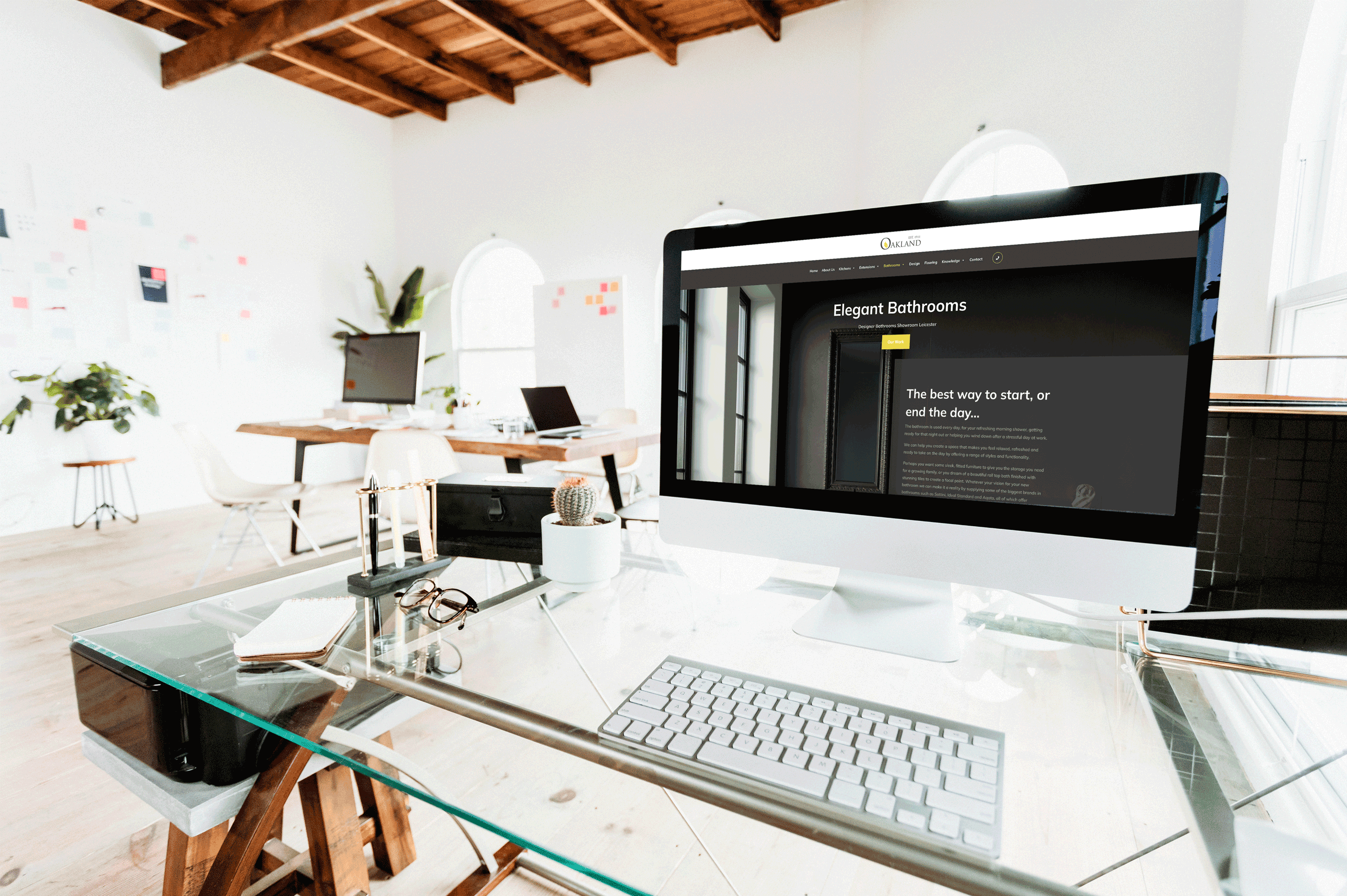
The look and feel of your website can define how the user experiences your site, and ultimately, if and when they will use it again! It should also clearly convey your brand’s message, your company’s ethos, your USP. However, just having the right content is not enough, you need to allow the user to have an easy, no-hassle journey through your site – making it enjoyable, ensuring that the user will use the website again.
The “look” is defined by the following:
- Colour themes – on trend colours, or colours that reflect your business and relate to your user. The colours used throughout the website must be of relevance to the subject matter, images or brand identity. You want your site to flow, clashing colours will only cause the viewer issues. If using colours for text, ensure they are easily read, your audience do not want to strain to read what you have to say.
- Image style – using imagery that portrays your message, whether it’s emotional or fun, will impress a visitor making it memorable
- Overall Design – using a coherent design throughout, with consistent design features will bring your site in line with your brand and allow the users journey to be insightful and interesting
- Font size and style – these will set the overall tone of your site; if you want to be bold – be bold, or if you wish to be romantic use a handwritten script font. Designers use complimentary font families for harmony in any type of design. This helps break up quantities of text and makes the overall design more appealing. Type should have a hierarchy using size, bold, italic and other styles, white space around it and colour to move the user’s eye down the page.
- Groupings of text elements are easier to absorb than one huge block of text. No one is going to read a huge block of text because it creates instant information overload which will make the user leave the page. The following types of textual elements could be grouped into two paragraphs, four paragraphs, bullet points etc to help with the design or layout, but more importantly for easy readability.
o Headline
o Subhead
o Subhead 2
o Paragraph text
o link text
o bullet points - Page load speed – nobody likes a slow loading site – the visitor will be long gone by the time your images have loaded…
The “feel” is determined by these features:
- Interactive components – these make your users feel engaged with your site, and in turn, your brand. For example, the drop-down buttons, zoom features for images, interactive graphics, colour-changing icons/buttons, motion designs, colour contrast typography, textures, gradients, shapes, etc – all of which add a layer to the website and its interactivity. All these can spark a conversation and get your audience more focused on the website and its message.
- Navigation – make it easy with seamless transitions, let your content flow simply allowing it to be understood – leaving the visitor with a sense of your site’s identity, making it stand out in a crowd.
- Great Value – create an environment that your visitors will want to stay in longer, making use of your website functions. Allowing your information to be easily accessible will get your users coming back again and again….
- External links – having valid and trustworthy external links ensures the user that you are a reputable company and safe to use.
You will find that adhering to these suggestions, your audience will appreciate the effort you have put in to making their experience of your site easy, informative, and enjoyable. Your message will be conveyed clearly so you will get returning business!
Need help with your website? Do you need a brand new site, or a remodel?
Contact Trident today and we will guide you through the process.


