Geometry in Graphic Design is a huge trend for this year, it’s all around us. Everywhere we look we can spot squares, lines, points, triangles, circles, rectangles… And by all means, all of those geometric elements have been so widely and joyfully used in graphic design all around the world for ages.
Geometry in Portraits
A trend that is extremely effective and striking is to break up photography with geometric designs. Creating a 3D effect in a 2D image, A real eye-catching effect to make portraits more interesting and memorable. This technique is a great way to bring your brand personality into stock photography.
Geometry in Photography
Another way to use geometry in graphic design is to use it to make up photography. This design takes sections of the larger photograph and moves in into new positions within the original picture. Overlay with wire frame shapes and the effect becomes really striking.
Geometry in Grids
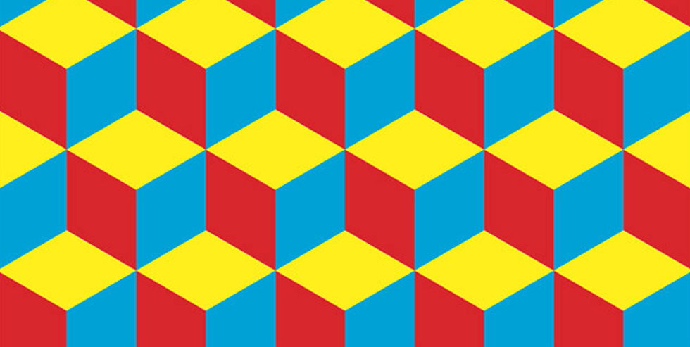
Using grids of different shapes that tessellate can be very effective. Hexagons and Triangles in particular. Use the shapes to highlight key points and logos, and different colours to pull out information. This technique is also very useful in pricing tables usually highlighting the centre column in a pricing structure.
Geometry in Illusions
Israeli energy company launched this print ad to promote green energy. The print ad just seems like a simple black-and-white drawing. However, when you hold it up to sunlight, vibrant colours appear.

Geometry in Movement
Geometry can also be used to highlight the movement of the physical form. In this example, a wireframe wraps around the dancer to emphasise their posture. This shows real thought when designing, combining geometry with physical movement to create a really unusual effect.
If you’re thinking about updating your brand identity, logo or need any other graphic design advice contact us, were happy to help with any questions you have


